Lecture
24
Plotting
matplotlib.org, examples using matplotlib.pyplot.subplot():
https://matplotlib.org/api/_as_gen/matplotlib.pyplot.subplot.html
We
only have two lectures to cover the plotting functions. To learn more
about it, please refer to the matplotlib.org website. The plotting
itself in Python can be an entire course for a semester!
1. Introduction
You
work hard on procssing and saving your data, the most exciting part is
to visualize your data and observe the trend!! We need figures to
present our rearch to other people. We did extensive amount of work in
MatLab to plot our data in the 1D, 2D, and 3D manner. Now, it is the
turn of Python!!
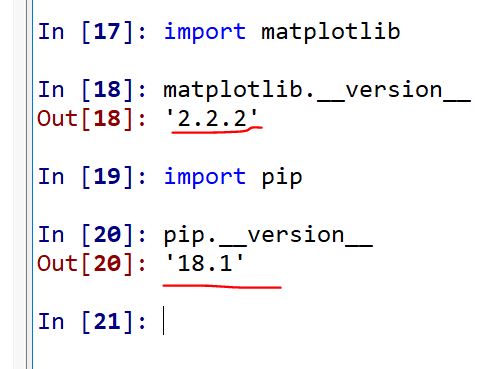
pip:
The pip command is a tool for
installing and managing Python packages, such as those found in the
Python Package Index. It's a replacement for easy_install.
matplotlib:
The function package for plotting in Python.
If you are using Spyder from Anaconda, you should have matplotlib and
pip already in your system.
You can check it in this way:
If you have these two packages installed already, you can skip all the
steps showed in the Python Crash Course textbook.
Now, let's directly dive into it.
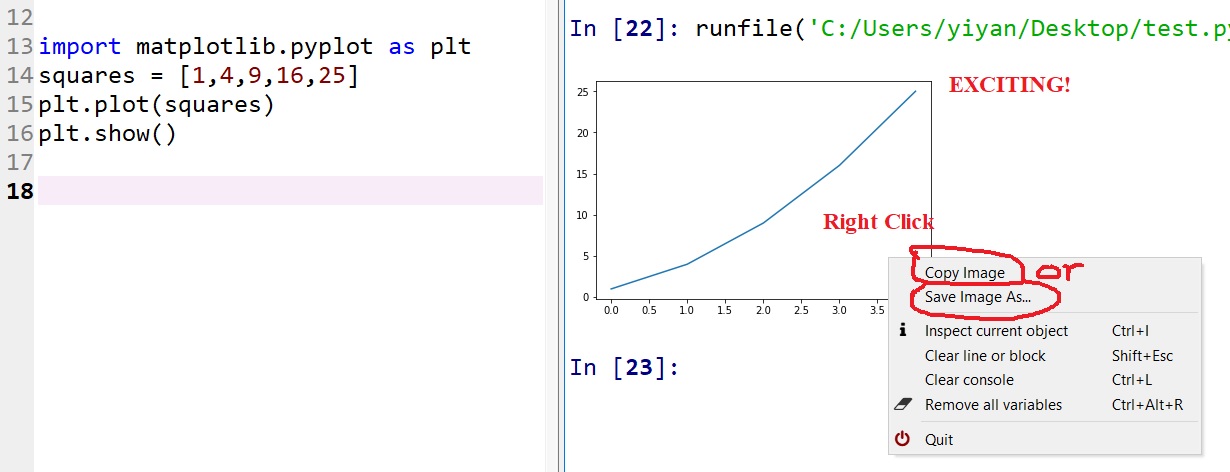
2. Plotting simple graphs
Let's plot a simple 1D vector:
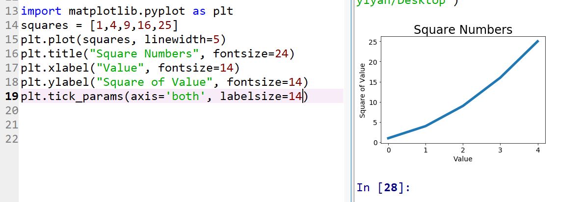
Change the label type and graph thickness and font size: It looks much
better after this modification.
(Please
notice that I didn't use 'plt.show()' here in Spyder. If you are using
Vim or other editors to run python from the command line, you may need
'plt.show()' every time you run this file)
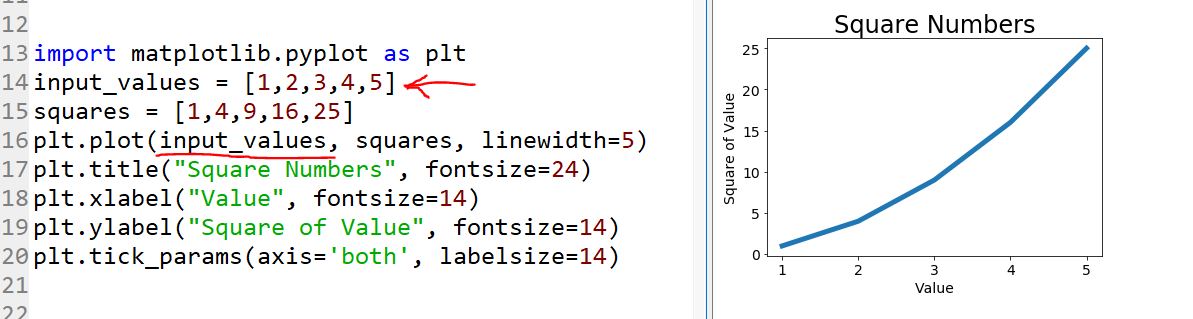
But now that we can read the chart better, we see that the data is not
plotted correctly. Notice at the end of the graph that the square of
4.0 is shown as 25! Let’s fx that.
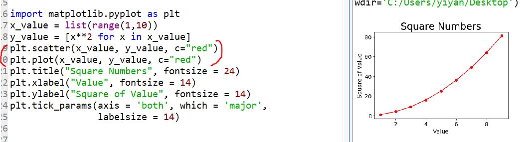
3.
Plotting and Styling Individual Points with scatter()
Sometimes
it’s useful to be able to plot and style individual points based on
certain characteristics.
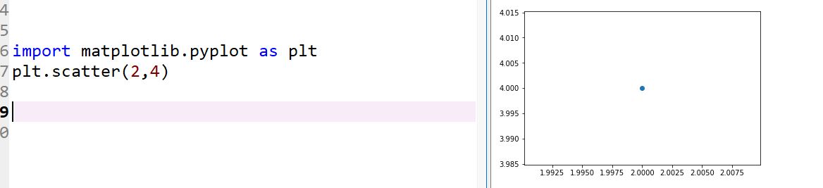
To
plot a
single point, use the scatter() function. Pass the single (x, y) values
of the point of interest to scatter(), and it should plot those values:
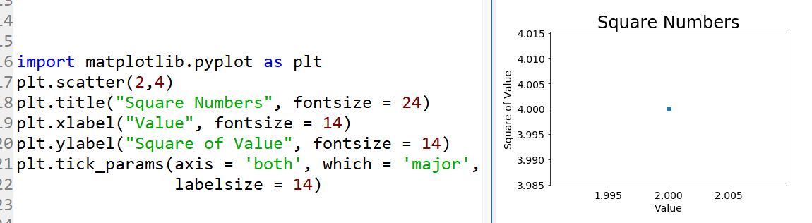
Let’s
style the output to make it more interesting. We’ll add a title, label
the axes, and make sure all the text is large enough to read:
4. Plotting a series of
points with scatter()
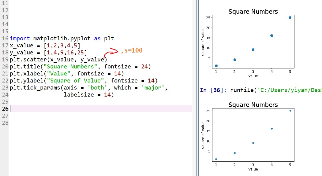
I
just showed you two different plots above. If you have
'plt.scatter(x_value, y_value)' then you will get the figure at the
bottom, if you use 'plt.scatter(x_value, y_value, s=100)' you will get
the one on the top. So 's=100' defines the size of the scatter points.
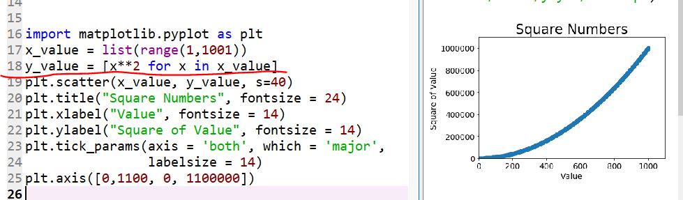
You
can create a series of y values by 'x**2 for x
in x_value'.
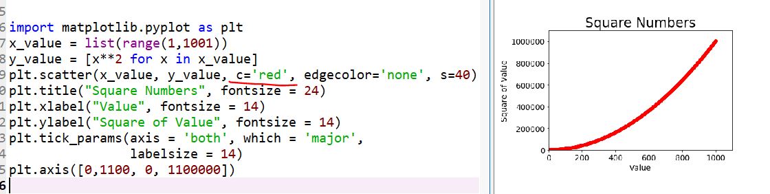
You can remove the edge of the scatter points :
plt.scatter(x_value, y_value, edgecolor='none',
s=40)
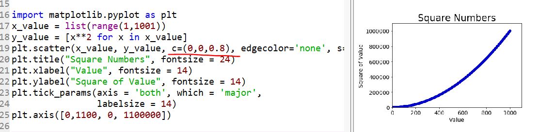
Defining custom colors:
This is even accepting RGB color schemes.
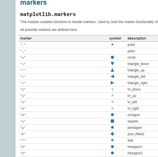
Change the marker style:
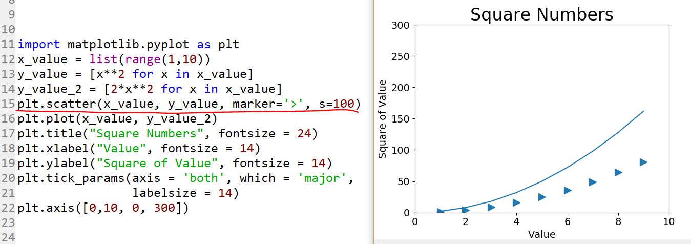
The marker styles can be
used in Python:
https://matplotlib.org/api/markers_api.html
A snapshot of the table:
5. Plot multiple curves
in one figure.
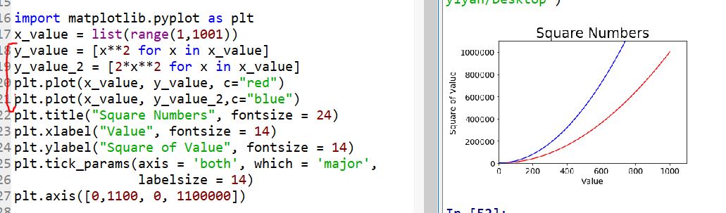
Add a legend to it:
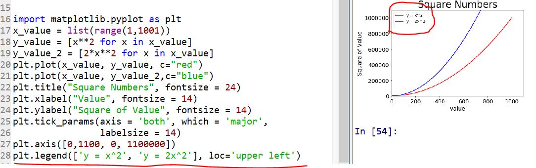
Plot the scatter points and the line in the same figure:
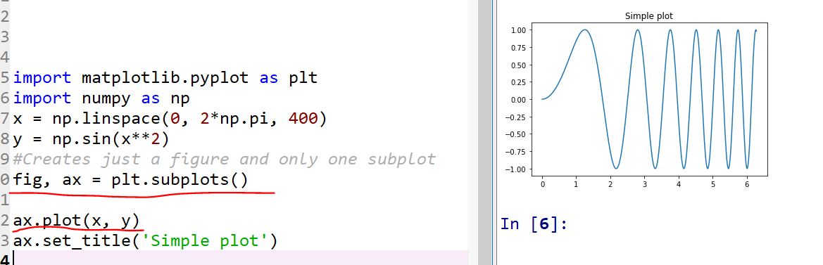
6. Subplots:
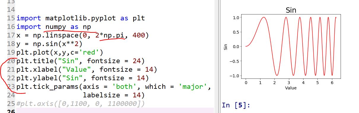
Here
is the example of a sin() function applied to x*2. Let's play around
with this figure using the subplot function in Python:
Let's plot it in the regular way first:
Then apply 'plt.subplots()'.
This returns two arguments: fig, and axes. They are:
1. fig : Figure
2.
axes: Axes object or array of Axes objects. axes can be either a
single Axes object or an array of Axes objects if more than one subplot
was created.
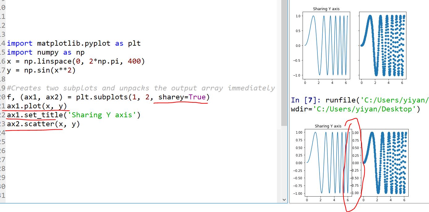
Having
two subplots and share the Y axis:
When have 'sharey = True' included, the two subplots will share the Y
axis.
The '1, 2' in 'plt.subplots(1,2,sharey=True)' means 1 row and 2 columns
of figures will be plotted.
In the following example, the top figure set applied the 'sharey=True'
statment and the bottom didn't.
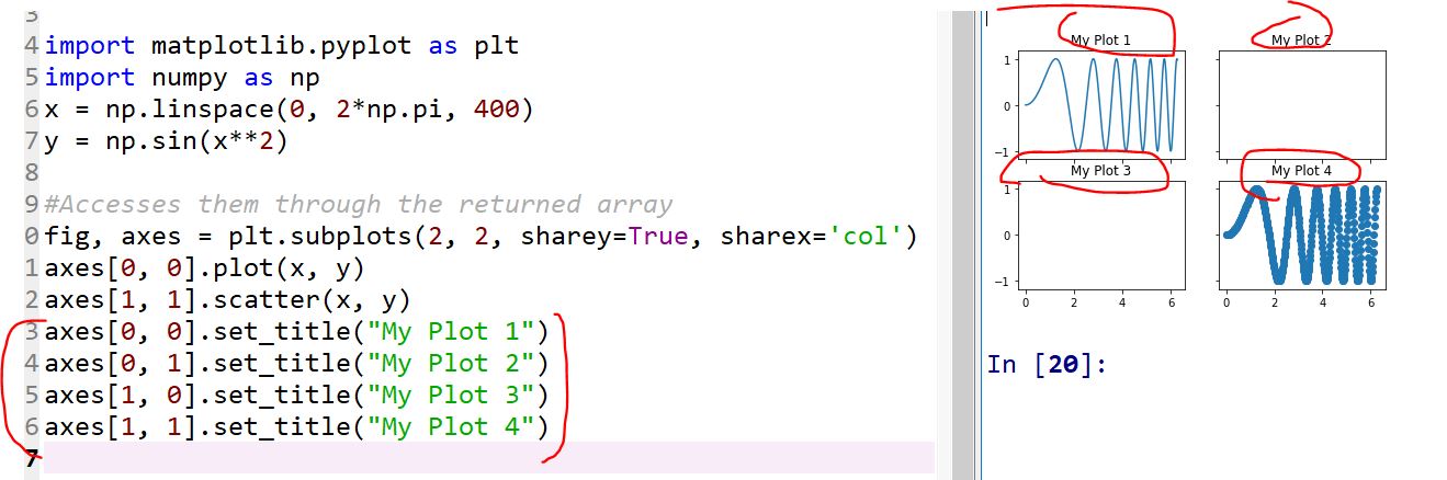
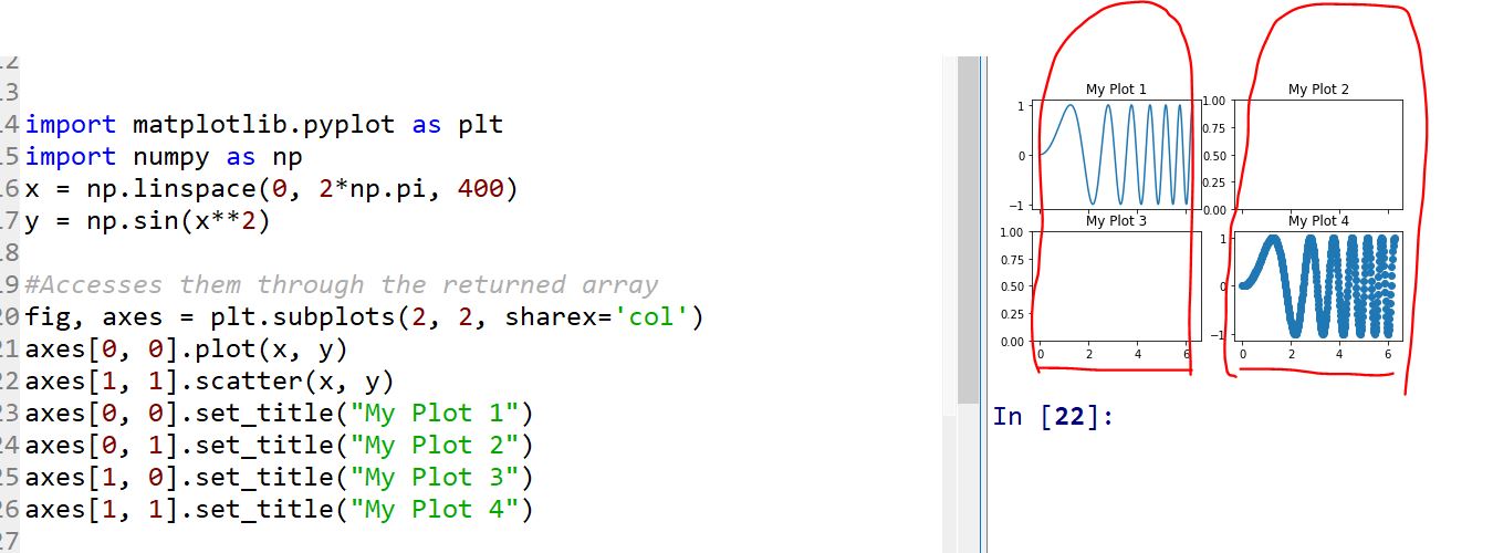
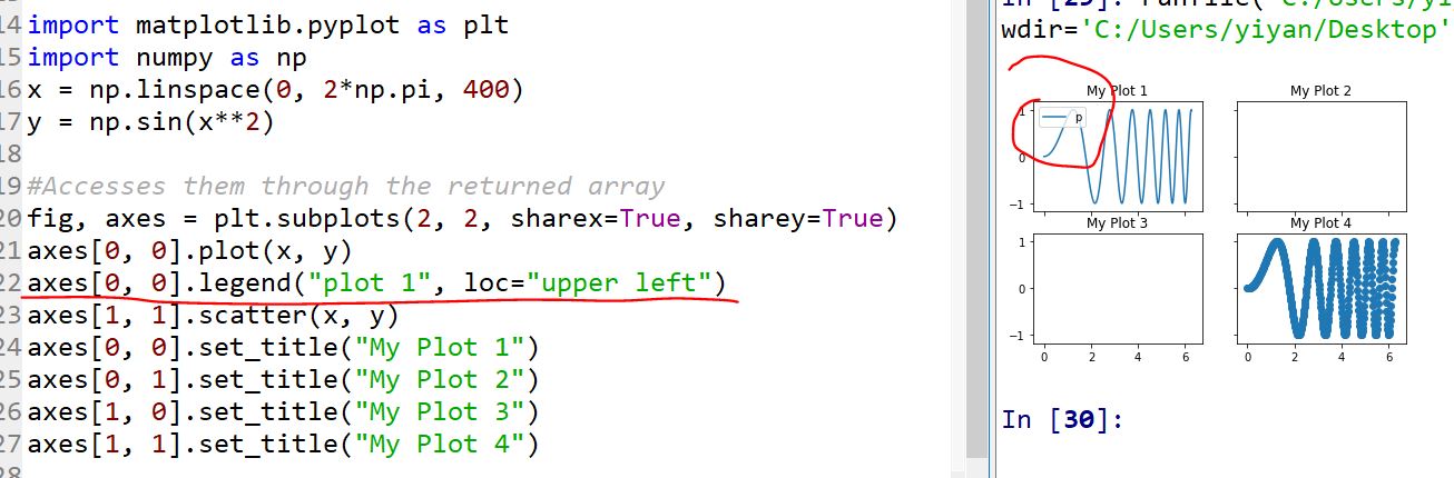
Accesses them
through the returned array
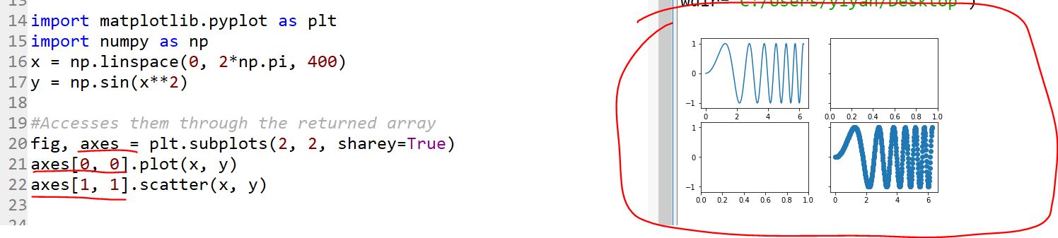
All the subplots are accessible. This enables so many capabilities. You
can change any property you like in each subplot:
Modify titles:
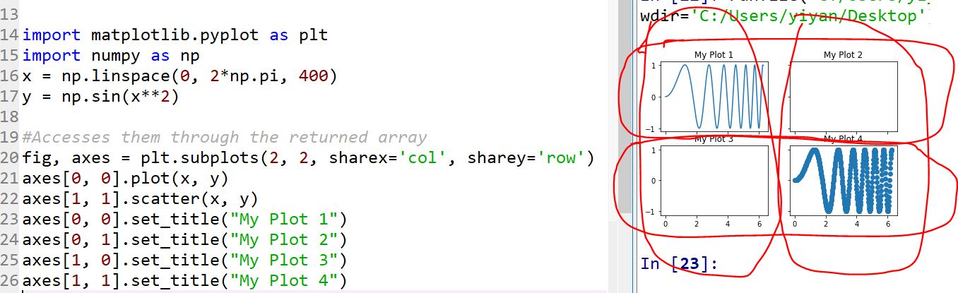
Let's modify the sharing axis thing step by step:
1) Share X axis with all figures in the same column:
2) At the same time, share Y axis with all figures in the same row.
3) To make it simple, you can also use 'all':
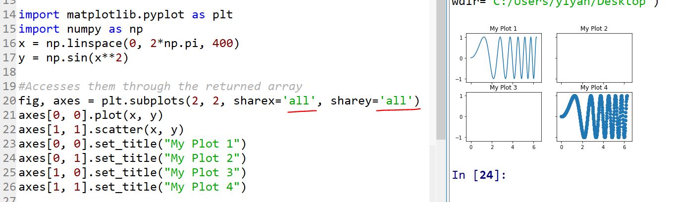
It is the same as:
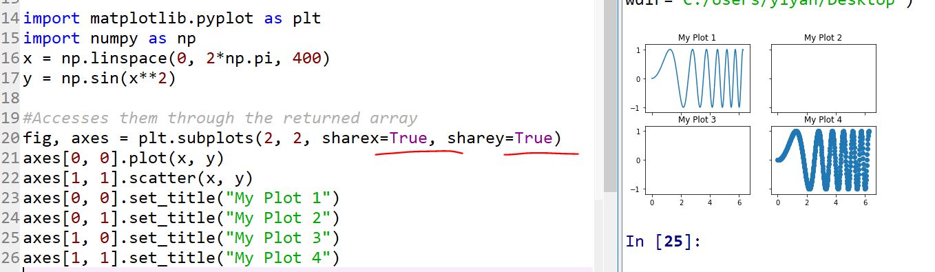
I'd
use 'sharex=Ture, sharey=True' more often. The subplots always have the
same Y and X axis. We usually put subfigures in one window to compare
the trend, so it is making sense to unify the X and Y axis.
One more thing:
Add a legend to it:
Tasks:
1. Repeat all the code in this tutorial and test if you can get the
same results. (sorry I know this is tedious, but please just type them
out and run them).
2. Plot
cos(x) and sin(x) in the same figure. The range of x is 0:2*pi and
there are 40 dots are being plotted. Your plot should have:
•
Two different markers for the two functions
•
Two different colors for the two lines
•
Have appropriate labels for both X and Y axis
•
A modified line width
•
Have legends to indicate the two curves are cos(x) and sin(x)
3. Use the subplot function in matplotlib to plot the following four
functions in the same figure but different subplots.
sin(x+pi/2), 2*sin(2*x+pi/4), 0.5*cos(x+pi/4), and 0.8*sin(x+pi/2).
Modify the axis, labels, fonts, line width, etc to make your figure
presentable.
Points will be taken off if the plotted figure is in bad quality.